Absorption Lines ~ Som Prasad ~ Blog


From Paul Klee

Paul KleeI recently discovered and investigated the work of Swiss painter, Paul Klee. I've definitely taken much inspiration from his minor detail to overall impression. I find his use of color, texture, and contrast to be so beautiful. In most of his paintings, you can take a magnifying glass and find a painting in each smaller section.

The painting to the right is from a much larger piece titled "Ad Parnassum", which is a large-canvas study. It spans to form an image, but when analyzed in sections, each one can be viewed as a work itself. The section to the right is one of my favorites with the simple lines, colors, and object details.

Klee was a student of watercolors, cubism, and realism. I am particularly drawn to his fantastical elements in works such as "Embrace" and "Legend of the Nile". He seems to capture emotion by obscuring faces and exagerrating features. At times, I think he has a very child-like quality in his presentation.

Though born in Germany and of Swiss decent, Klee's work reminds me of the American heartland. He frequently uses "crop" elements as seen in "Insula Dulcamara". I am also reminded of Native American wall paintings with the shapes and black lines.

I would love to see his work in person.

Links: Paul Klee Slide Show, Exhibitions, Gallery


LOST in Thought

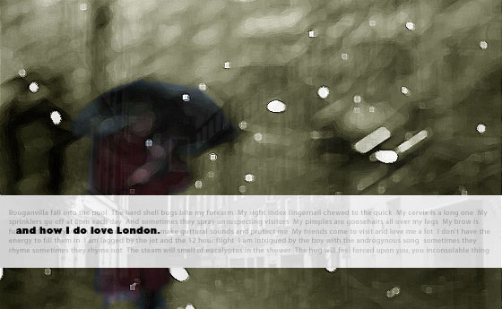
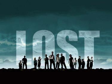
So it comes to this...after six years of question after question, mystery after mystery, and symbolism taken to an unheard of extreme, LOST has come to a close with nary an answer to the infinite question loop that the producers have spawned. The show will be debated for a long time and continue to confuse anyone who decides to watch.

Well, why watch? In the end, that is the only question that really matters with a TV show. The answer is really simple. Really really simple. It's so obvious it will make your brain hurt. LOST is a great show.

Wonderfully artistic and amazingly produced, LOST left no brush stroke to chance. For the last six years LOST has managed to make weekly TV viewing an experience like none other. In the meta-information age when every answer is a Google search away, LOST took the meta to unprecedented heights. Every scene had some symbol, some phrase, some obscure philosopher that could be researched to the viewer's every desire. And yet, the intricate story-telling and characters are really what kept viewers coming back for more.

LOST kept it's most ardent fans riveted with compelling story arcs, flawed characters (heros and villains), obscure locations, and epic music. Think of this show as a really good movie -- a 132 hour long movie that went on for six years.

We were introduced to polar bears on the beach, time travel, smoke monsters, looking-glasses, impenetrable hatches, and "Not Penny's Boat" all while rooting for characters that were deeply flawed, lovable, and infinitely relatable. We saw tragic heros, redemptive villains, adorable sidekicks -- and were captivated by them all. From "tallies" to "The Others", each sub sect offered another glimpse into the human condition. The debates were easy and current: Science vs. Faith, Good vs. Evil, David vs. Goliath. Each character and story-arc embodied some of that conflict.

As with any good art, the series left us wanting more. More clips, more answers, and yes, possibly even more questions. Questions of why characters did the things they did...perhaps why we do the things we do? And in the end, LOST left the answers up to the viewers. Exploring the mysteries of the Island was an apt metaphor for exploring the mysteries we each face. For every map or hieroglyphic LOST flashed on screen, there was some human resonance.

And so it ends, like all good things must, with a vague inclination of purpose and prose. LOST is over, charted and uncharted alike, left to be revisited on some rainy Sunday afternoon. Here's hoping for a storm.
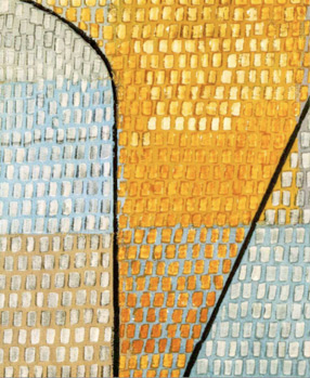
Links: ABC Site


Spectral Earth

Technology fosters art. Technology is art. And art fosters technology. So the cycle goes. All of this is evidenced by the Landsat 7 Satellite that took these stunning visuals of Planet Earth using eight different spectral bands. These images have the movement of aVan Gogh, the paint technique of a Monet, and the perspective of a Michelangelo. I am particularly drawn to the varied colors. I think it is a very interesting study in nature and art - and the derivatives of each.

Spectral Earth

Links: Bolvian Deforstation, Campache, Great Salt Desert, See All 60 via WebDesignerDepot


Pandora Radio Is Now Everywhere

Pandora Radio
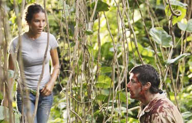
I've been using Pandora Radio on and off for a few years now, but only now that the iPhone application has been released that I've become an addict. I think it is one of the best applications out there, and I've found myself with a constant stream of music that I had no idea I could be bothered to listen.

So far on my iPhone I've set up radio stations for Tori Amos, Sufjan Stevens, Bird and Bee, and Wolf Parade. My Wolf Parade has been my most listened, and I've discovered so many good songs that require another listen and further investigation.

What I love most about Pandora Radio (other than always having it on me), is that you can save, catalog, and buy whatever you're listening wherever you are.

Links: Pandora for iPhone, Pandora Blog (a good way to find playlists), Music Genome Project


My New Macbook

So I took the plunge and bought myself the new Macbook. I find myself in a constant state of internet readiness with this thing...which may or may not be a good thing, I am still deciding.

The machine is really beautiful, solid, and quiet. I've been doing all my freelance work on it, and it has yet to give me any trouble. I've been lugging it around with me most days, and a few times forgot I even had it on me...it is that light. I'm glad I saved some cash for opting out of the Macbook Air.

The screen is pretty nice, but I'm having some issues with color calibrations. I wiill have to look into finding a new profile.

All in all, nice work Apple, but why must you keep tempting me with new machines? I've put a moratorium on any new tech until 2010...yes, I have. I think.


Celebrating Holi

Hindus celebrated Holi, the Festival of Colors, and one of my favorite blogs did a photo entry on the celebrations. Visit Boston Globe's "The Big Picture" for some amazing shots of Holi in India. I thought I would link to these beautiful photos, it would be so amazing to be in India for this welcoming of Spring. My parents told me that it is a really fun time, but it takes weeks to feel clean again!

Celebrating Holi

Links: More Holi Photos from The Big Picture, Holi (Festival of Colors), The Big Picture Homepage


James Stewart Paintings

James Stewart PaintingsI had the great opportunity to design a website for a friend and former collegue of mine, Jim Stewart. He recently retired and has gone into painting and art full-time.

He had been in the graphic design business for over 20 years, so he had some ideas about web design. I basically took his initial concept and converted it to the web.

I had a lot of fun designing this site, and I finally got a chance to use Lightview for larger image galleries. It was great to finally get a chance to work on an artist site, and I hope I get more projects like this down the road. I think it turned out really nice.

I also got a chance to visit his studio at 915 Spring Garden. The entire building is full of working artists, and they did an open house so it was great to soak in inspirations from other artists. Check out the site if you get a chance.

Links: JameStewartPaintings.com


And how I do love London.

Inspirations: "London", City of London


Mad Men

Mad MenOne of the best tv shows of the last two years has to be AMC's Mad Men. Set in the late 1950s and early 1960s, the show focuses on a team of ad executives on Madison Avenue aka the self-coined "Mad Men" and all the trouble they get that finds them.

I'm not sure how I got tuned into the show, it was probably by accident and word of mouth, but it has really captured me. The characters are so detailed with real, vivid histories and interpersonal hell. They seem to thrive on a competitive, ultimately un-fufilling set of circumstances that they don't know how to escape.

It is very interesting to me to see the ads, stereotypes, and assumptions of generations gone. In the pilot episode, they remark on the advanced technology that is a typewriter. The backdrop of the late 50s and early 60s becomes a character itself, shaping the conflicts that the characters face.

The art direction is one of my favorite aspects of the show. From the opening montage of images and music, the entire show sets a dramatic, satirical tone that is really engaging. Everything looks and feels vintage, from the hoop skirts to the cadillacs and cuff links. I think it is the setting and style that first got me hooked. Who knew AMC had it in them?

Links: Opening Credits, Official Site, Simpson's Spoof


Absorption Lines

A dark line or band at a particular wavelength on a spectrum, formed when a substance between a radiating source and an observer absorbs electromagnetic radiation of that wavelength.

I’m sure that you’ve been briefed
my absorbtion lines. they are frayed
and I fear. my fear is greater than my faith
but I walk. the missionary way.
you always felt like suede.
there are days I am your twin. peekaboo.
hiding underneath your skin.
jets. are revving yes revving
from an ether twist.

Credits: Thanks to everyone who helped me in getting this website together!
- Thanks to Linh Ta for the sliding menu, you're amazing!
- Lightview is done by Nick Stakenburg
- Some Philly photos found on Google
- Images in Design Portfolio courtesy of their
respective companies or studios

Links: "Suede", Absorption Lines in Physics